Megan Colnar is the Director of Monitoring and Evaluation at The Hunger Project. On her recent travels, she witnessed how community members explore and participate in understanding data about their communities. These forums promote community participation and provide an opportunity for women and men to discuss the objectives and interests of the community. This is Part 1 of a series on community data presentations.
In November of last year, I traveled to visit two of our epicenters: Zuza in Mozambique and Champiti in Malawi. Both epicenters had recently undergone an internal outcome evaluation. The evaluations conducted were a baseline study in Zuza and a midterm study in Champiti.
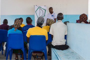
Ismael, THP-Mozambique M&E Officer, leads a discussion on Zuza’s results from the women’s empowerment index
Our internal evaluations are randomized household studies where members living in communities in each epicenter’s target community area have an equal chance of selection. Before conducting a study, we always host a community forum where all are invited to hear about the details of the study, the selection of households, and the importance of the randomization protocols. It’s also an opportunity to introduce the enumerators (typically university students from a nearby school) to the community and to discuss the objectives and interests of the community in epicenter programs.
After the study is finished, the Monitoring and Evaluation (M&E) Officer from the national office returns to the community with the calculated indicators to ask the community for help interpreting and validating the results. They also take part in problem-solving and planning conversations to decide which results need to be targeted for improvement.
We don’t shy away from the complicated stuff—we dive right on in. We talk about random selection and percentages. We compare values from previous surveys or other nearby communities. And, what’s more, the communities seem to love it. People are very passionate about their communities and want to see things move forward.
Collectively, The Hunger Project has a lot of knowledge on this topic. We’ve hosted these data engagement sessions in sites across nine countries. In our experience, these three things make the biggest difference in engaging the community and increasing understanding:
-
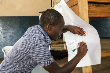
Henry, The Hunger Project-Malawi M&E Officer, putting the final touches on a chart during a power outage
Visuals. Hearing the numbers isn’t always enough. Seeing a current figure compared to its target, understanding proportions through a pie chart, or watching poverty fall through a time series graph makes a big difference. We prepare data visualizations ahead of time—charts, graphs, and pictorial representations of statistics uncovered in the study. Depending on the facilities where the presentation will be held (i.e. indoors/outdoors, electricity available), hard or soft copies will be made. Though we’ve also learned that you can’t always rely on stable electricity so it’s best to have research paper topics charts just in case!
- Interactive. For non-data geeks, numbers can get boring and repetitive. The example in the below photo shows what 80% looks like: two people are sitting out of the standing group.
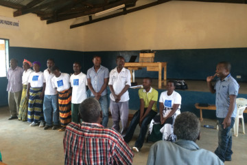
Volunteers help demonstrate “eighty-percent” during the Champiti presentation
This goes a long way in bridging the gap from the concept of “eighty-percent” to what it actually means in a community.
- Comparisons. Sometimes people need a step further to digest and process data. Visuals are great, group activities are fun, but the questions of where are we going and where do we want to be often dominate the conversation. To help with these questions we provide comparisons. Sometimes we use national level data, but most often we use either targets communities have set for the programs (i.e. endline goals) or data from a similar study in a neighboring community. In our experience, these work best. In particular, people seem to love the friendly ‘competition’ with their neighbors. Everyone wants to be the best. Here is what Lucas, a Zuza local chief representative says: “Comparing our results with Chokwe (neighboring epicenter), we realize what is on the other side—what is possible. We are ready for it!”
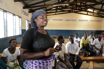
Lorni, Women’s Empowerment Program Committee Chair at Champiti Epicenter in Malawi
We still have a lot of experimenting we want to do in terms of involving communities in M&E systems, but these three things have really made a difference in giving energy to the events and keeping interest high.
As Lorni, the head of our Women’s Empowerment Committee in Champiti Epicenter said: “The evaluation helped us see where we’ve come from, what we’ve achieved and where we’re going.”
At The Hunger Project, we can’t wait to see where this is going next.